Pentel 999 HB Review

Introduction

IMG_20160403_153743

I found out about Pentel 999 scrolling through JetPens. I found it interesting that they described it as “Pentel’s highest performing professional wooden drafting pencil” as I am not that familiar with many of Pentel’s pencils. Though they were only relatively recently discontinued, they are difficult to acquire. However, I was lucky enough to get one through a trade (thanks Jack!).

Specs

Place of Manufacture: Japan
Price: ~$10 on the secondary market

Packaging

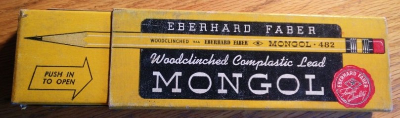
From the pictures, the pencil originally came in a black box with grey writing. This matches the style, both in font and color, of the pencil itself. As I received the pencil through the trade, I did not get a box.

Fit and Finish

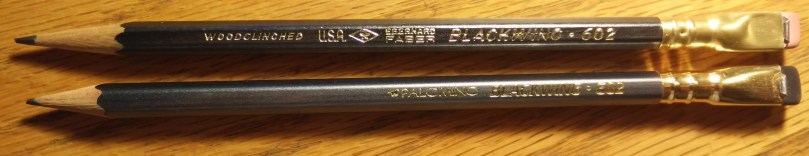
The pencil, being NOS, has some wear and tear. It appears as though the pencil was finished with a gray layer and then a black layer on top. There is some speckling on the barrel of the silver coming through the black paint.

IMG_20160403_143535

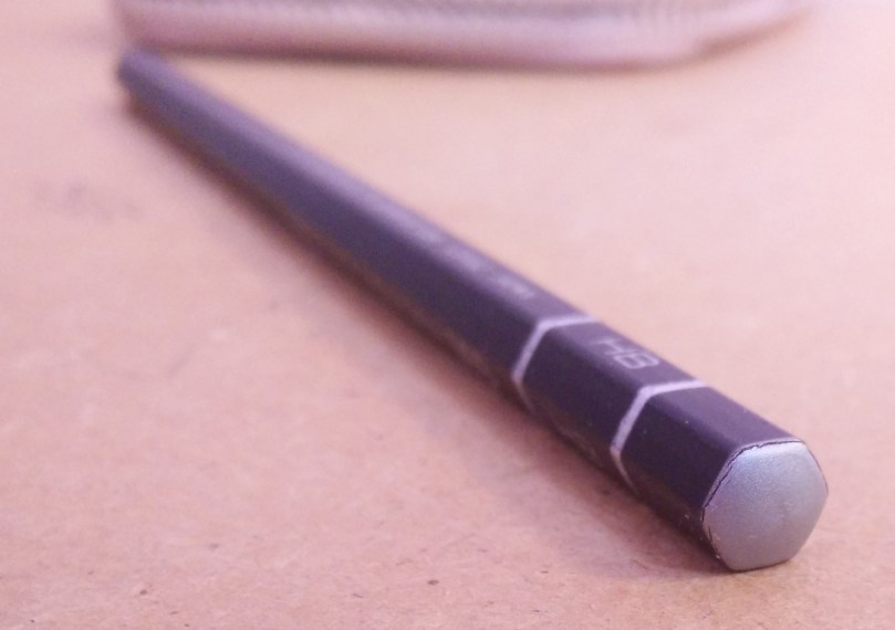
The end of the pencil features some cracking on the gray end.

IMG_20160403_143543

The gray rings around the barrel surrounding the graphite grade are not perfect and the edges are jagged. It appears as if there were multiple coats of paint put on unevenly or something.

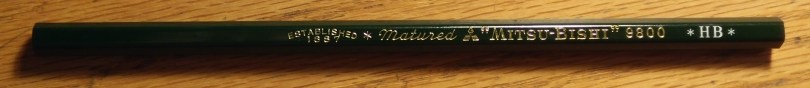
The pencil is super light for its size. It has no ferrule, but it still weights less than any of the ferrule-less pencils I received in the trade and less than my commonly used Mitsubishi 9800.

Overall, the finish is not as good as I saw in the pictures, but perfectly understandable considering that this is a NOS pencil. The type of paint they used on the barrel is susceptible to these types of speckling and, as a user, I don’t think I’ll mind it too much.

Design

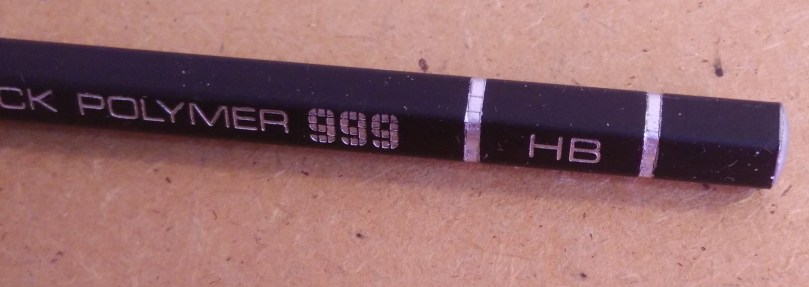
The pencil features two main colors: a grayish silver and black. The barcode and UPC on the back are printed in white. As stated before, I believe that the pencil was coated in Silver before a layer of black was overlaid.

The font chosen is a sans-serif font that is “boxy”. The individual letters are wide and it works well with the feeling of the pencil. The “999” is created with smaller squares. This gives it enough pop without standing out too much.

Functionality

IMG_20160404_150018

Sharpening the pencil for the first time was frightening. Not knowing how it would sharpen, I was afraid that I might waste a large portion of the core due to some random mishap. Luckily, that did not happen.

IMG_20160404_150540

I love the way the pencil writes. The pencil is light but still feels balanced in the hand. The lead is smooth. Way smoother than any HB that I’ve used (even smoother than the Hi-Uni). It makes a dark line that is easy to read. The one issue I have with it is that it seems like the tip degrades quickly. This can make for some big line variations depending on whether or not you rotate your pencil when using it.

Conclusion

I’d love to have more of these. They write like a dream. They’re not without their flaws, including a paint job that is lackluster and a tip that requires rotating. However, the dark line it puts down and the feedback it has makes up for it. I don’t think I’d pat ~$10 for a pencil based on my experience, but I will treasure the one that I have and use it whenever I want a change in feel.

Eberhard Faber Mongol 482 No. 2 Review

Introduction

^DC5B2C5DCCC65AEB6A2B9E41054B63984E94A1D22AEDF59CC6^pimgpsh_fullsize_distr

The Mongol series from Eberhard Faber is a famous one. John Steinbeck was said to prefer Blackwings and Mongol 480s. Here, I have a box of 482s, which look as school-like as pencil can look. Do they stand up to their lore, or has age gotten the best of them? Let’s find out.

Specs

Place of Manufacture: USA
Price: $20-25 a box, up to $200 for early 1900s version

Packaging

^DC5B2C5DCCC65AEB6A2B9E41054B63984E94A1D22AEDF59CC6^pimgpsh_fullsize_distrIMG_20160326_162309

I love the box. It features a full size picture of the pencil on the front. There are many different fonts above and below it, drawing the eye to different sections. On the back, there is a brief description of the the pencil with the different hardnesses that it comes with. I believe this is the second generation of boxes. The first generation had an Asian theme to it.

It is two pieces, with one half larger than the other. The inner section pushes out to access the pencils.

The other sides of the box feature a similar design with the front with one of the edges having the hardness of the lead.

Fit and Finish

IMG_20160326_221302IMG_20160326_162443

Being a vintage pencil, it can be a bit difficult to judge quality. Over time, moisture and dryness can both affect the wood and the lacquer.

I immediately noticed a few issues with the printing. The printing was not very crisp and the lettering was not centered perfectly on the side.

IMG_20160326_221324

On the back, a bit of paint was chipped. It would appear as though this happened when the ferrule was attached. The ferrule itself has a gold band that has held up well over time. There is some discoloration on the black areas though.

Design

As stated before, the pencil has that school look to it. The yellow is similar to the cheap dollar store pencil shade and it has the pink eraser stuck to the end of it. That being said, there’s absolutely nothing wrong with a traditional look like this. In fact, I find it to be quite appealing, especially with the execution. The small details, such as the gold band around the ferrule and, once again, the fonts used really make this pencil stand out.

Functionality

IMG_20160326_220426

The pencil writes quite well. It has a tad of feedback like the Mitsubishi 9800 HB, but lacks some of the smoothness. It has a dry feeling on the paper rather. It doesn’t glide as much as move across the paper.

In comparison to modern Japanese pencils, such as the Hi-Uni and Mono 100, the pencil is harder. I like, however, how it produces a dark line while have little wear down. I can see myself using this pencil for a long time before sharpening. It compares well to a Cedar Pointe though I like the Mongol’s core a tad more.

Conclusion

I like the Mongol 482. It doesn’t write as nicely has a Blackwing 602 but it wasn’t meant to compete with it. The Mongol is a business and school pencil. It was designed for lots of writing and lots of use. Its original price point was low enough where you wouldn’t feel bad about losing it, comparing with the Blackwing which was a premium product.

I’m glad I picked up a box. I don’t think they’ll replace my Mitsubishi 9800s, but whenever I’m looking for a change, I’ll pluck one out of the box and give it a go.

Mitsubishi Vermillion and Prussian Blue Pencil Review

IntroductionIMG_20160319_163321

Red and blue combination pencils have been popular for a long time. They offer the user two contrasting colors in one writing utensil that can be used for tasks such as proofing, highlighting and drawing. Here, Tombow has produced a combination pencil with a unique ratio of red and blue. How well does this pencil work?

Specs

Place of Manufacture: Japan
Price: $7-8 for a box of 12


Fit and Finish

IMG_20160319_163302


Design


Functionality

IMG_20160319_163243


Conclusion


Mitsubishi Hi-Uni Review

Introduction

IMG_20160319_161307

The Mitsubishi Hi-Uni is a high end pencil. Two or three pencils equating the cost of a box of Mitsubishi 9800s, the Hi-Uni is supposed to be much better than its workhorse relative. But how much better can a pencil be?

Specs

Place of Manufacture: Japan
Price: $20-25 for a box of 12, $2-3 per pencil

Packaging

The Mitsubishi Hi-Uni comes in a nice plastic case when a dozen are purchased. There is an inner plastic divider to separate the two layers of six pencils. The build quality is quite decent and it keeps the pencils safe. I like it so much that I still use it to hold some of my favorite pencils.

Fit and Finish

IMG_20160319_161348

The level of detail and meticulousness that Mitsubishi has put into this pencil is amazing. The maroon lacquer is perfect (out of the box, that is) and there are no scratches nor is there chipped paint. The lettering is crisp and precise all around. The foil band around the end is straight and fits perfectly in the groove that is cut into the wood. The graphite core sits very centered. I have no complaints at all.

Design

IMG_20160319_161307IMG_20160319_161339

The design of the Mitsubishi Hi-Uni has one flaw: the clutter. The barcode on the backside along with the UPC set this back from other pencils such as the Blackwing.

Similarly, the multitude of fonts used on the pencil can make it an eyesore.

However, the colors used, red, black and gold, work well together.

Functionality

IMG_20160319_161754

The jump from a 9800 to the Hi-Uni is quite evident. The Hi-Uni has a much smoother core than the 9800 while maintaining a certain level of feedback. The pencil is obviously harder than a Blackwing 602, but will not lose to it in terms of smoothness. It has a bit of residue when writing with lots of pressure, but normal writing will erase well.

Sharpening the pencil is fun. The cedar the Mitsubishi has used in the pencil smells great and sharpeners glide through the wood.

Conclusion

The Mitsubishi Hi-Uni is a high end pencil. It features a good lead core, nice wood and great fit and finishing at a more expensive price. It has a few design issues, but overall, it is a great pencil.

Lamy Al-Star Review

Introduction

IMG_20160311_153710

As with many fountain pen enthusiasts, my first fountain pen was a Lamy. I received the Lamy Al-Star as a gift after expressing interest in writing with fountain pens. It doesn’t get used as often as my Platinum 3776 Century. Read on to find out why.

Specs

Dimensions: 140mm (length), 13mm (diameter)
Weight: 20g
Place of Manufacture: Germany
Price: $47 (retail), $37 (most retailers)

Some History

The Lamy Safari is one of the most common starting pens. Being inexpensive, coming a reputable (debatable) manufacturer, and being fairly durable, it lightens the learning curve. The Al-Star and the Vista are variants of this design, with the nib and feed remaining the same. The Vista is transparent while the Al-Star is made of anodized aluminum.

Fit and Finish

The Al-Star has somewhat better tolerances than the Safari. It suffers some of the regular issues such as a hit-or-miss feed and nib as well as some general quality issues with the body. For example, the plastic has a few ridges from the molding and the LAMY engraving (or perhaps pressing) on the body has irregularities in the corners.

IMG_20160311_153645

Functionality

The pen comes in all normal Lamy Safari nib sizings. This fine nib is a European fine and puts down a line equivalent to a Japanese medium.

IMG_20160311_164407

The pen does not have much flex.

The converter is a Z24 that can hold around 0.6 mL.

Conclusion

As a first fountain pen, the Lamy Al-Star has some merit. It has a solid construction and the pricing makes it almost acceptable to drop it nib-first on the ground when you’re still learning your way.

With European nib sizing, it can be a bit hard to get finer lines and the irregularities and inconsistencies with Lamy production can make one pen lovely to use and another pen a prop.

For beginner pens, I’d personally recommend the Sailor HighAce Neo. While quality of construction is about the same, the quality of the nib is a bit better and it comes in at a lower price.

Platinum Century 3776 EF Review

Introduction

Processed with VSCO with a6 preset

My Platinum Century 3776 is my daily driver for all my writing tasks. Whether I bring it to class, I clip it to my shirt when I’m all dressed up, it’s usually either in my bag or in my pocket. Sure the body has signs of wear due to all this carrying, but I wouldn’t have it any other way. Here’s some words on my trusty fountain pen.

Specs

Dimensions: 120mm (length), 13mm (diameter)
Weight: 20g
Place of Manufacture: Japan
Price: $220 (retail), $70-100 (eBay, direct from Japan)

Background

When I was picking out my next fountain pen,I had a Pilot Custom 74 in one hand and the Platinum in the other. These two pens are are very similar in many ways. They are of similar length, made of similar material, and both feature 14k nibs. However, there were a few small differences that made me choose the Platinum over the pilot.

PackagingIMG_20160304_221648

The pen comes in a plastic snap box, housed in a white cardboard sleeve. The case feels appropriate for a pen of this price. It is sturdy and cushioned for the pen. The ribbon holding the pen is taut and it can be a bit difficult to put the pen back if you wanted (as I did for the pictures).

Fit and Finish

IMG_20160304_221818

The pen body is made out of resin which I assume is an alternative (fancier/more accurate) name of the type of plastic that is used. The light weight can be a tad off-putting and the texture that it has can feel a bit cheap.

The pen has gold trim from top to bottom. The cap features a gold pocket clip and there is a gold band with the name of the pen around the bottom of the cap. Additionally, there are two more smaller gold bands on the main body of the pen.

The nib is rather large in comparison with the Pilot (this was one of the reasons I chose the Platinum). The gold content, Platinum “P” and “#3776” are engraved on the nib.

The pen supposedly comes with a “Slip and Seal” technology mechanism that is to keep the ink from drying out for up to 24 months. The spring and additionally plastic sleeve used in this technology is easily seen through the plastic cap.

Functionality

IMG_20160308_164037

I’m a student and this pen is exactly what I need it to be. I don’t need super flex or BB nibs. What I need is a pen that will work day in and day out. This is exactly that pen. The thin narrow line that it produces is not overly wet, though it starts every time.

The body is very prone to scratching. I don’t carry the pen in the same pocket as my keys, but scratches of all sizes have slowly appeared. The trim, however, does not seem to have chipped at all.

Conclusion

I have no regrets with this pen. Sure, it has an outdated appearance and can look a bit out of place. However, the way it performs and the feeling it has in my hand is… I can’t put it in words.

Eberhard Faber Blackwing 602 (Vintage) Review

Introduction

IMG_20160126_214139

I’ve been a fan of wooden pencils for a while, so when an opportunity fell into my lap to try out a legendary pencil at a fraction of the price for a brand new unsharpened one, I jumped at it. Here, we’ll be discussing the original Eberhard Faber Blackwing 602. A comparison between this pencil and its remake, the Palomino Blackwing 602, can be found here.

Specs

Date manufactured: 1950s-1970s (my guess is that this particular example was made in the 1960s)
Price: $50-60 (New), $20-30 (Used, depends on length)

Fit and Finish

12636827_794968853964061_946472443_o

Pencil has a beautiful charcoal colored lacquer with gold lettering spelling out the iconic “Half the Pressure, Twice the Speed”. Due to age, it appears as though the paint has started to crack down the middle. I would assume that it is cracking where the two halves of the barrel were connected together.

The eraser is held in place with the distinct ferrule. It is easy to replace the eraser if you so wish. Palomino sells many different colored replacement erasers or you can cut one out of your favorite eraser.

Functionality

IMG_20160126_215441

The lead is super smooth. There’s a tad of feedback, although none that could be called scratchy. The lead wears done quickly when sharp, so line variation can vary mid-sentence unless you rotate the pencil. However, writing on a dull point seems to alleviate the problem.

The stock eraser test was done out of pure curiosity. Being a vintage pencil, the eraser has surely somewhat dried out so it’s effectiveness has probably been diminished.

Closeups of each section of the writing test are available below.

Conclusion

The pencil has a writing experience second to none. I regularly use Mitsubishi Hi-Uni’s and 9800’s, but they don’t feel as nice as the Blackwing. It’s hard to describe the combination of smoothness and feedback, but it makes it a joy to write with. Plus, the line it puts down is just a joy to look at. While the price of a new pencil may be a bit steep (and it can be a bit hard to start sharpening a brand new one), a used Blackwing 602 is much more affordable and is a great gateway to experience this legendary pencil.

Blackwing 602: Eberhard Faber vs Palomino

IMG_20160215_214652

The Blackwing 602 might be one of the world’s most famous pencils. In its original iteration, Eberhard Faber created a pencil using fantastic wood and a near magic lead. To this day, there are those who swear by this vintage pencil and hold it second to none. However, for those that aren’t willing to shell out the incredulous sums for a pencil (not even mentioning the dwindling numbers of them), there is the new version made by Palomino. It has a similar color, look and ferrule, but how does it stack up to the vintage marvel?

IMG_20160215_214659

The original Blackwing 602 (reviewed here) feels premium in the hand. The lacquer does not feel or look glossy but, instead, looks matte and feels delicate. On the other hand, the Palomino has a high sheen. It is silky smooth to the touch and it reflects light like fresh snow. I personally prefer the Eberhard Faber paint although the gold foil letter is often too fragile because of age. The Palomino feels like a tank that can hold up to being thrown into a backpack or a pocket.

IMG_20160215_214659

The recognizable ferrule is almost identical on both. On the original, there were a few versions with a black band (these are often more expensive). Erasers are interchangeable and I have no complaints with either.

IMG_20160215_214743

Now for the important part: the graphite. Here’s the brutal truth: I’d be fine with either pencil. Both leads feel smooth gliding across paper. There are minor differences though. The original Blackwing seems to have a tad more feedback than the new one. It’s difficult to describe the feeling as it does not feel scratchy or rough, though you know it’s there. On the other hand, the Palomino is just straight up glass smooth.


Mitsubishi 9800 Review

IMG_20160215_214248Introduction

I’m just going to put it out there: the Mitsubishi 9800 is my favorite production everyday use pencil of all time. I’m not going to say it is better than a Hi-Uni or Swiss Wood or vintage Blackwing, but for the normal workday (or school day), this pencil excels.

Specs

Place of Manufacture: Japan
Price: $7-8 for a box of 12

Packaging

When purchased in a box of 12, you get a nice vintage looking box.

Fit and Finish

IMG_20160215_214346

The pencils have relatively good fit and finish. The paint is consistent and the gold foil is crisp. The quality of the wood is not always the same. Some halves are darker than the others. While it makes no effect with the writing experience or sharpening, it can be a bit of an eyesore. The leads are well centered.

Around the ends, there are times when the edges have chipped paint. I would guess that it occurred either from cutting the wood or when the pencils were being packaged. Once again, it’s not much of a functional issue, but it does affect the aesthetics.

Design

The pencil features a no-nonsense design. There is gold lettering featuring the company name, model and lead hardness. There is no eraser.

FunctionalityIMG_20160215_214419

I love this pencil because of its workhorse abilities. The pencil is light and well balanced because of the lack of ferrule and eraser. One can sharpen it from both ends for long, uninterrupted writing sessions.

The pencil comes in many different lead hardness grades (is that a word?) including HB, B, 2B, F, H, and 2H. I personally like the HB and B grades. The B grade gives a much darker line than the HB grade while the 2B wears down super quickly. Furthermore, the 2B smears very easily. With decent pressure, the HB gives


Conclusion

I use this guy for everything. It’s not supposed to be a safe-queen and you shouldn’t treat it as one. I love it because it’s cheap and reliable. If I could have one pencil in the world, I’d choose a Mitsubishi 9800.

Rotring 600 0.5mm Review

IntroductionIMG_20160127_232013

When one talks about premium mechanical pencils, there are usually two ways the conversation can go: luxury or drafting. Here, we discuss one of the most common drafting pencils. The Rotring 600 has been around for a while (still researching its history) though its newest version began in the 1990s with Rotring having been bought out by Sanford. It has a very fragile tip that many new users have bent beyond repair and a price that is way above similar Pilot and Uni offerings. So, how does Rotring stand up to the lore it carries?

Specs

Lead size: 0.35mm (effectively 0.3mm), 0.5mm, 0.7mm, 0.9mm
Country of Manufacture: Japan
Price: $50 (Retail), $20-25 (Amazon)

Packaging

The Rotring comes in a lackluster cardboard box. While the Midori Pen Case also came in a cardboard box, the Rotring’s feels noticeably cheaper. Inside, there is a cardboard divider forcing the pencil into a snug corner. The pencil is sheathed in a plastic bag which it can easily slip out of (which can give a scare to the one opening the packaging). On the other side of the divider, there is a small information pamphlet that provides some general use tips and warranty information.

Fit and Finish

Upon holding the pencil, the first reaction most people have is “this is so heavy” and it’s true. At around 20 grams (more accurate number to come), the pencil is much heavier than store bought Bic mechanical pencils.

Taking the pencil apart, one finds that there is a minimum of plastic components. I’ve done some research on the history of the pencil to find out that the internal mechanism used to be completely metal. However, the plastic in the pencil does not feel weak and I do not fear that it will fail to work anytime soon.IMG_20160127_232325

Functionality

Holding the pencil is a joy. The knurled grip provides a wonderful surface to hold. The Alvin Draft-Matic (a similar pencil based on the Rotring 500) has a sharper grip that can be painful to hold for long periods.IMG_20160127_232229

The mechanism seems to take any type of lead. I have fed HB, B, and 2B leads from different manufactures and no single brand seems to break more often. As a matter of fact, even though it has a thin tip, lead breakages are seldom and are mostly from user error.IMG_20160127_232409

The thin tip is an area of concern. Having seen many pictures of the result of fallen pencils (most should be marked “nsfw”), when I bought the pencil, I immediately dug up an old tin pencil case from my childhood to protect the pencil when I took it from my desk. It has since been replaced with a Midori Pen Case.IMG_20160127_232503

I have not used the eraser although I will note that it is about the same size as Pilot P20x series pencil erasers. It feels like it is on the dry side.IMG_20160127_232119


Conclusion

The Rotring 600 is a wonderful pencil. It is easy to write with it for long periods of time and it is very robust, sans the tip. This is one for the pocket.