
Introduction
Midori is very famous for their Traveler’s Notebooks and their brass products. While they have produced pencils in the past, for their brass pencil extenders, the Midori MD pencil is their first full size pencil. The MD line (which I believe stands for Midori Diary) is known for its simplistic design and light colors. Does Midori pull through with their first full-length woodcased pencil?
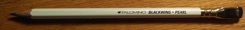
Specs
Shape: Hexagonal
Length: 176mm
Diameter: 7mm
Weight: 5g
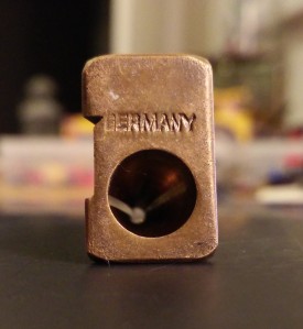
Place of Manufacture: Japan
Design

The pencils come in a pack of six within a slim plastic package. There is a small label in the packaging, similar to those included with other Midori MD products. As always, there is nothing gaudy about the packaging.


The writing on the label is playful and is meant to mimic handwriting. Luckily, it is not hard to read. The back of the label only has a barcode and some recycling information.
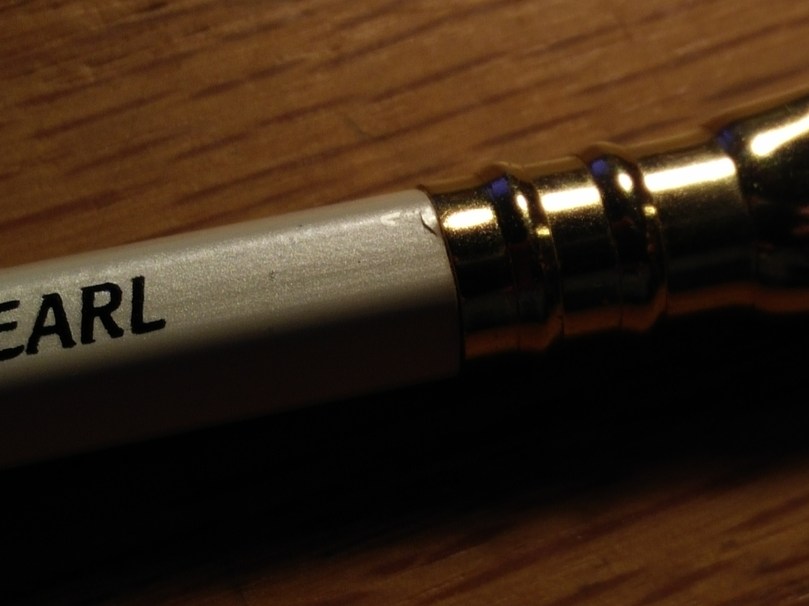
The pencil itself is very simplistic. The barrel is hexagonal and is a light cream color. The paint is matte and does not reflect any light. While it is smooth, you can definitely “feel” the pencil between your fingers. There is no ferrule.

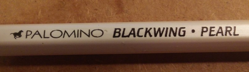
There is black lettering on one side of the pencil with the words “Midori MD” as well as “B” to indicate the hardness. There is no other writing or imprinting on the pencil.
Fit and Finish


The pencils feel solidly made, although the paint is not the best. It appears as though the paint rubs off easily, as seen in the above pictures.
The lettering is pretty good, although not that sharp on the edges. This might have been done on purpose as part of the font, but it looks a bit sloppy.


The two halves of the barrel are matched well and the core is well centered. However, the paint around the edges came chipped. It is not apparent whether this happened during manufacturing or during packing.
Functionality

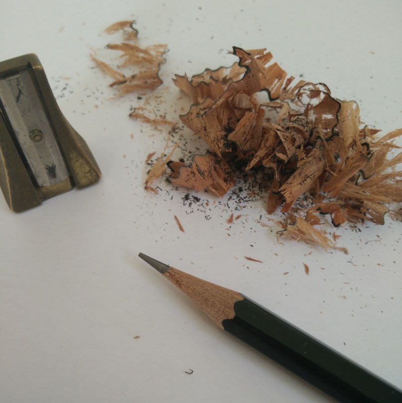
Sharpening the pencil in my Carl Angel-5 was very smooth and easy. As expected, the pencil left some bite marks in the barrel. It did not expose bare wood, but, instead, the marks were paint filled.

The point was moderately long and well rounded. The barrel did not split upon sharpening. There was no excess shavings hanging on after sharpening.

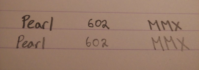
The core is a tad harder than most Japanese pencils of hardness “B”, writing closer to a Mitsubishi Hi-Uni “HB”. The writing experience was “all right” at best. It is better than your run-of-the-mill dollar store pencil, but, at least for me, the amount of feedback the core was giving me was somewhat unpleasant.
However, a few days later, I was curious enough to pick it back up and give it another go. During my second attempt at using it, I found it to be better than I first thought, and definitely usable, although it will not be winning any awards in my book.
I will note that my opinion on the tactile feedback that the pencil gives is just my take on it. I am sure some will appreciate it.

That being said, though, I do like how dark of a line the pencil puts down. Furthermore, it erases easily and point retention is pretty good.
Conclusion
I am a bit disappointed by these pencils. The quality was not as good as I was expecting and the writing experience was not not up to par in comparison to Midori’s paper offerings (in my opinion). Aesthetically, once you get over the dirtied surfaces, the pencil is elegantly simple and is comparable to the Mitsubishi White Pencil in looks.
I probably won’t be picking any more of these up in the future. I’m still on edge about whether I’ll keep the ones that I have. To each their own, though.


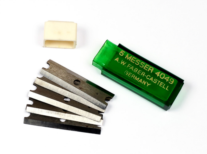
 I managed to purchase an A.W. Faber 4046 off of Etsy for a decent price. Faber 4046s go for between $40 and $100 depending on condition.

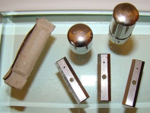
 If there was anything that disappointed me about the purchase, it was the condition of the screw. It looked as though someone used a screwdriver that was too small and completely mangled the head of the screw. I have not attempted to remove it yet, but once I do, I will be trying to find a replacement at once.


 The store is arranged in the shape of a zero. The middle island has a wide range of pens and pencils including the Pilot Preppy and a variety of Autopoints. I personally enjoyed the selection of dip pens and nibs. If you ask, they will let you try out any of the handle and nib combinations with any of the inks that they have.
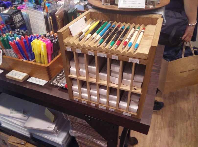
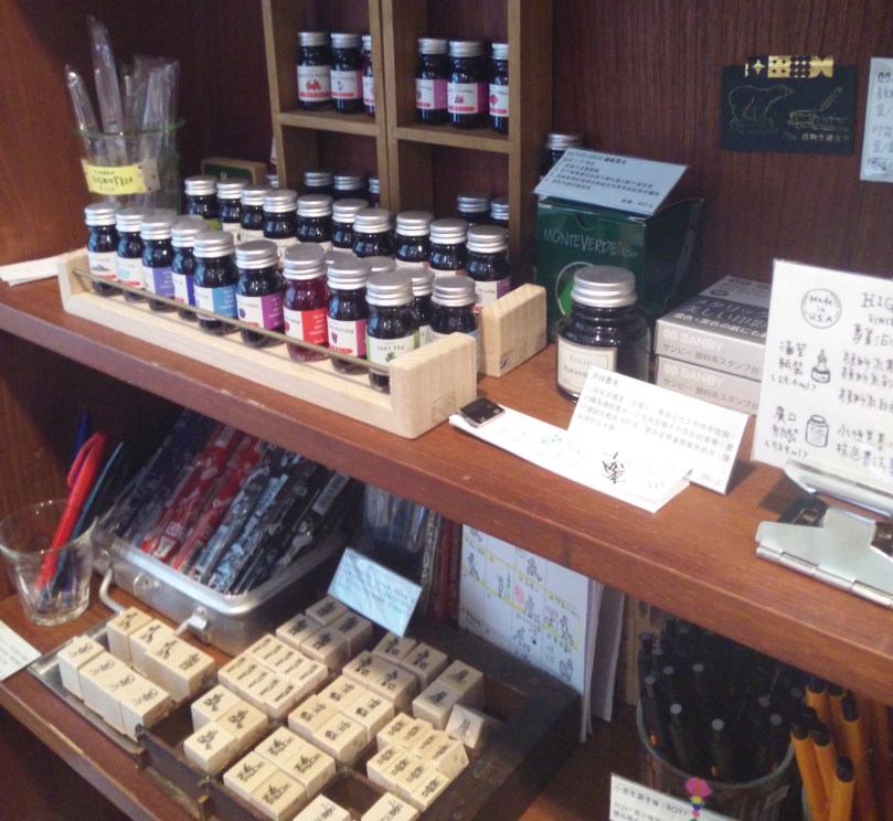
 he counter holds some of the more expensive and the “deadlier” items. They sell whale shaped knives (it is where I bought mine) and a bunch of different Higonokamis. More recently, he has also been importing a few multitools and one-piece tools. Tiger managed to import Rotrings and Fisher items to his store and, due to their price, they are also kept behind the counter.
 On one of the walls, there is a wide selection of notebooks and clips. There are Field Notes, Campus, and Life Notebooks. Prices for Japanese products are much lower than in the US, while American products are a tad higher.
 enjoyment, they have 0.4mm lead in stock, which is often hard to find in stores in the US.


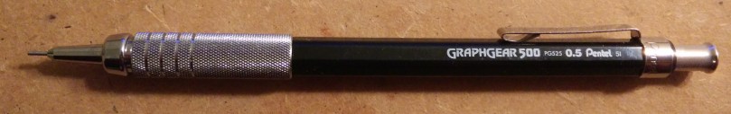


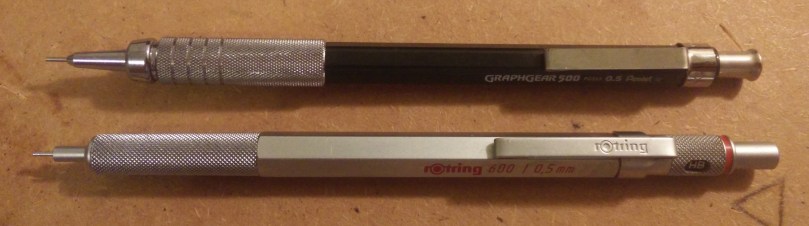
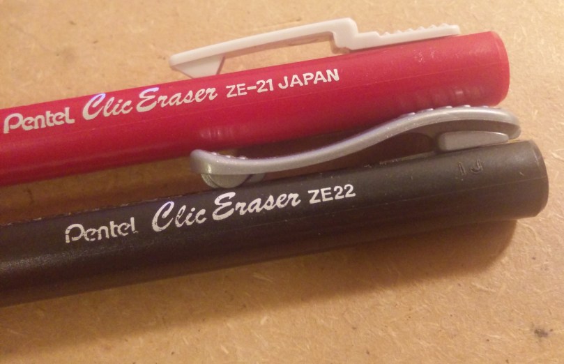
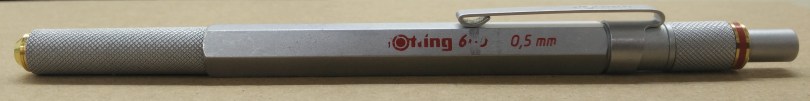
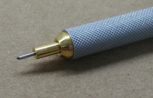
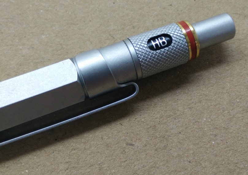
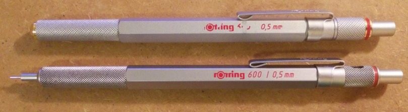
 There are many similarities between the Pentel Graphgear 500 and the Rotring 600. Perhaps the most notable is the tip section. The Graphgear has a larger grip and has additional “milled” rings. Although it looks nicer than the Rotring, the Graphgear as a certain cheap feeling to it. I suspect I feel this way due to the metal that is used (steel in the Graphgear vs brass in the Rotring). The tips are of similar length although the there is more distance between the grip and tip in the Graphgear. This wastes more lead as there is more distance between the mechanism and the tip. Further, depending on how you like to hold pencils, the distance may be too long for your taste.