

Introduction
The Mongol series from Eberhard Faber is a famous one. John Steinbeck was said to prefer Blackwings and Mongol 480s. Here, I have a box of 482s, which look as school-like as pencil can look. Do they stand up to their lore, or has age gotten the best of them? Let’s find out.
Specs
Place of Manufacture: USA
Price: $20-25 a box, up to $200 for early 1900s version
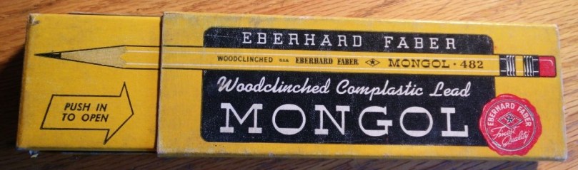
Packaging

I love the box. It features a full size picture of the pencil on the front. There are many different fonts above and below it, drawing the eye to different sections. On the back, there is a brief description of the the pencil with the different hardnesses that it comes with. I believe this is the second generation of boxes. The first generation had an Asian theme to it.


It is two pieces, with one half larger than the other. The inner section pushes out to access the pencils.


The other sides of the box feature a similar design with the front with one of the edges having the hardness of the lead.
Fit and Finish


Being a vintage pencil, it can be a bit difficult to judge quality. Over time, moisture and dryness can both affect the wood and the lacquer.
I immediately noticed a few issues with the printing. The printing was not very crisp and the lettering was not centered perfectly on the side.

On the back, a bit of paint was chipped. It would appear as though this happened when the ferrule was attached. The ferrule itself has a gold band that has held up well over time. There is some discoloration on the black areas though.
Design
As stated before, the pencil has that school look to it. The yellow is similar to the cheap dollar store pencil shade and it has the pink eraser stuck to the end of it. That being said, there’s absolutely nothing wrong with a traditional look like this. In fact, I find it to be quite appealing, especially with the execution. The small details, such as the gold band around the ferrule and, once again, the fonts used really make this pencil stand out.
Functionality

The pencil writes quite well. It has a tad of feedback like the Mitsubishi 9800 HB, but lacks some of the smoothness. It has a dry feeling on the paper rather. It doesn’t glide as much as move across the paper.
In comparison to modern Japanese pencils, such as the Hi-Uni and Mono 100, the pencil is harder. I like, however, how it produces a dark line while have little wear down. I can see myself using this pencil for a long time before sharpening. It compares well to a Cedar Pointe though I like the Mongol’s core a tad more.
Conclusion
I like the Mongol 482. It doesn’t write as nicely has a Blackwing 602 but it wasn’t meant to compete with it. The Mongol is a business and school pencil. It was designed for lots of writing and lots of use. Its original price point was low enough where you wouldn’t feel bad about losing it, comparing with the Blackwing which was a premium product.
I’m glad I picked up a box. I don’t think they’ll replace my Mitsubishi 9800s, but whenever I’m looking for a change, I’ll pluck one out of the box and give it a go.
