Montblanc 149 Review

Introduction

Montblanc, along with Parker and Waterman, seems to be one of those fountain pen brands that even non-enthusiasts seem to know. Their pens can sometimes be quite gaudy, although their Meisterstück line has a certain classic feel to them. The Meisterstück 149 is the largest and most expensive pen in their non-limited edition model lineup. Does it stand up to the price it takes to own

The pens I will be reviewing today were purchased from a local seller and were manufactured in the 1980s. The pens are near identical except for the nibs.

Specs

Length: 14.7cm
Diameter: 14.8mm
Weight: 29g
Place of manufacture: Germany
Price: $935 (retail), $650-800 (street)

Design

The Montblanc 149 has been produced since the late 1940s. Since the beginning, it has featured the classic cigar shape, a piston filler, and a big number 9 nib.

The barrel was initially made of celluloid, although, they later switched to a material they call “precious resin”, essentially a hard, secretly formulated plastic.  The material does not scratch easily, although the scratches that do exist are quite obvious in contrast to the high polish surface.

IMG_20170721_155603_edited

The barrel is made from a single piece. Later varieties are made from two pieces. There is an ink window near the grip section. It is slightly tinted, with vertical stripes. The threads for the cap are cut at the height of the barrel.

IMG_20170721_154258_edited

In contrast to the black body, there is plenty of gold trim. On the cap, there is a band with the words “…”. The engraving (or perhaps stamping)  The clip has the place of manufacture “GERMANY” stamped in it. On later models, a serial number was also added. The number can be helpful in dating a pen.

IMG_20170721_154209_edited

The nib material has also changed over the years, switching from 18 karat to 14 karat and then back to 18 karat gold, with different styles of plating over the years, ranging from dual tone to triple tone.

IMG_20170721_154416_edited

The feed is made from ebonite. Fins are cut on both sides, with a solid spine down the middle. This is the “split feed” variety . Later feeds were made from plastic.

IMG_20170721_160202_edited

The two stage piston was originally made of brass (the threads) and plastic, although in recent years, the entire assembly is now from plastic. The first few turns of the knob does not move the piston. This is to prevent one from accidentally discharging ink. Following the first few turns, the piston begins to go down. The reservoir has a very large capacity of 2ml.

IMG_20170721_155526_edited

A very nice timeline was created by “DKbRS” on The Fountain Pen Network. The thread can be found here. I used the guide to help me date my pens.

Fit and Finish

IMG_20170721_155250_edited

As with most Montblancs, the fit and finish of the pen is mostly near perfect. The nibs are hand-finished and it shows. The tines are not perfectly centered (although as I’ll mention later, this does not affect functionality in the least). The engravings are also nicely done, although they are not perfectly symmetrical.

The piston is very smooth. The tension twisting the knob is very smooth at every stage. When the knob is in its closed position, there is no gap between the knob and the body. When the piston is fully extended, there is a bit of give, which immediately springs back when you let go. I assume this is a indicator that the piston is fully extended and to help prevent accidentally snapping the piston.

IMG_20170721_154354_edited

The cap fits very well on the body. The threads fit very tightly, with no movement between the cap and body when closed. The engraving on the gold band around the cap is done very nicely and is consistent between pens.

Functionality

IMG_20170721_160112_edited

Filling the pen is very easy with the piston filler. A plunge or two fills most, if not all of the reservoir. Flushing out ink, however, can be quite time-consuming. The large feed accommodating the large nib has the unfortunate ability of retaining ink remnants. Soaking the entire pen in water seems to help with the process, though.

IMG_20170721_160933_edited

The pen is a joy to write with. With such a large pen, the grip section is very comfortable and is at a nice balance point for the pen when un-posted. Due to its large size, the pen is probably best used un-posted. That being said, one probably wouldn’t want to risk scratching the pen by posting the pen anyways. There are some posting marks on the barrel of one of the pens. Not very deep, but noticeable to a careful eye.

IMG_20170721_160918_edited

The nib is surprisingly flexible and the pen is able to produce a multitude of line variations. The feed keeps up no matter how wide the tines are spread.

Flexing the nib does require more force than vintage pens. Although the pen is pre-owned, I don’t believe the pen was used much. Even so, the nib is tuned to be very smooth from the factory.

The clip is springy and holds a pen firm in a shirt pocket. It does not stretch much, though, and would not comfortably clip into a jean pocket without permanently bending out of shape.

Value

The pen retails for $935, making it the most expensive pen from Montblanc’s regular lineup. That being said, I would have a hard time justifying buying the pen retail. Luckily, the pen is commonly found, new, from different retailers for a few hundred lower. Pre-owned, the pen can be found for $3-500, depending on the year that it is manufactured and the condition.

For me, the bottom line is that the pen is a manufactured, plastic-bodied pen. While there is some value in the nib, which is made in house, and the fact that it is hand-tuned, one could get a similar feeling from a pen made by on of Japan’s big three for much less.

Conclusion

All this being said, the Montblanc 149 is a very nice pen, with a very ugly price tag. Sure, it is big, gorgeous, and carries the allure of a brand like Montblanc. However, I would expect so much more from a pen at the price range. Therefore, these pens will soon no longer be in possession.

Midori MD Pencil Review

Introduction

Midori is very famous for their Traveler’s Notebooks and their brass products. While they have produced pencils in the past, for their brass pencil extenders, the Midori MD pencil is their first full size pencil. The MD line (which I believe stands for Midori Diary) is known for its simplistic design and light colors. Does Midori pull through with their first full-length woodcased pencil?

Specs

Shape: Hexagonal
Length: 176mm
Diameter: 7mm
Weight: 5g
Place of Manufacture: Japan

Design

IMG_20170721_142517_edited

The pencils come in a pack of six within a slim plastic package. There is a small label in the packaging, similar to those included with other Midori MD products. As always, there is nothing gaudy about the packaging.

The writing on the label is playful and is meant to mimic handwriting. Luckily, it is not hard to read. The back of the label only has a barcode and some recycling information.

The pencil itself is very simplistic. The barrel is hexagonal and is a light cream color. The paint is matte and does not reflect any light. While it is smooth, you can definitely “feel” the pencil between your fingers. There is no ferrule.

IMG_20170721_143605_edited

There is black lettering on one side of the pencil with the words “Midori MD” as well as “B” to indicate the hardness. There is no other writing or imprinting on the pencil.

Fit and Finish

The pencils feel solidly made, although the paint is not the best. It appears as though the paint rubs off easily, as seen in the above pictures.

The lettering is pretty good, although not that sharp on the edges. This might have been done on purpose as part of the font, but it looks a bit sloppy.

The two halves of the barrel are matched well and the core is well centered. However, the paint around the edges came chipped. It is not apparent whether this happened during manufacturing or during packing.

Functionality

IMG_20170721_151228_edited

Sharpening the pencil in my Carl Angel-5 was very smooth and easy. As expected, the pencil left some bite marks in the barrel. It did not expose bare wood, but, instead, the marks were paint filled.

IMG_20170721_151357_edited

The point was moderately long and well rounded. The barrel did not split upon sharpening. There was no excess shavings hanging on after sharpening.

IMG_20170721_151401_edited

The core is a tad harder than most Japanese pencils of hardness “B”, writing closer to a Mitsubishi Hi-Uni “HB”. The writing experience was “all right” at best. It is better than your run-of-the-mill dollar store pencil, but, at least for me, the amount of feedback the core was giving me was somewhat unpleasant.

However, a few days later, I was curious enough to pick it back up and give it another go. During my second attempt at using it, I found it to be better than I first thought, and definitely usable, although it will not be winning any awards in my book.

I will note that my opinion on the tactile feedback that the pencil gives is just my take on it. I am sure some will appreciate it.

IMG_20170721_152115_edited

That being said, though, I do like how dark of a line the pencil puts down. Furthermore, it erases easily and point retention is pretty good.

Conclusion

I am a bit disappointed by these pencils. The quality was not as good as I was expecting and the writing experience was not not up to par in comparison to Midori’s paper offerings (in my opinion). Aesthetically, once you get over the dirtied surfaces, the pencil is elegantly simple and is comparable to the Mitsubishi White Pencil in looks.

I probably won’t be picking any more of these up in the future. I’m still on edge about whether I’ll keep the ones that I have. To each their own, though.

IMG_20170721_142829_edited

Mike Draper Mini Titanium Spatula Review

Introduction

A key tool in food preparation is a good spatula. They can be used to flip burgers on the grill or to make the perfect egg. Mike Draper gave his spatula high end treatment with the use of titanium. Coming in both standard and mini sizes, the shiny titanium is definitely a show stopper. However, is the titanium just a gimmick or is there value to its usage?

This product was provided by EatingTools for review.

Specs

Maker: Mike Draper
Materials: 6AL4V Titanium, stainless steel screws
Dimensions: 2.125″ x 2.875 x 7.875″, 0.22″ thick
Weight: 1.5 oz
Price: $32.50 from eatingtools.com

Design

img_20160909_152251

Mike Draper has two sizes of spatulas available: A larger “standard” spatula and a mini spatula. The basic shape of the two are the same, but there are also some differences. The larger version has both an angled and a flat blade style.

draper-titanium-spatula
Picture from eatingtools.com

Additionally, the larger version uses four screws instead of only three on the mini version. The butt of the handle has two different designs. One version is curved, matching the curves of the drilled holes. The other version has a slightly pointed end.

img_20160909_152138

On both versions of the spatula, there are two main parts consisting of two pieces of titanium, a handle and a blade. The blade has a single bend in it, giving it rise up to the area that connects to the handle.

img_20160909_152300

The handle also has a bend, which corresponds with the bend in the blade. There is a hole drilled at the end of the handle for a wrist thong or for hanging up.

img_20160909_152205

Fit and Finish

When it comes to any handmade product, fit and finish is a defining feature of its quality.

img_20160909_152338

The fit and finish on the spatula is great. The spatula has a brushed finish that resists scratches and wear well. However, it is a finger print magnet. Thankfully, a wipe with a cloth will remove the oils left from your hand.

img_20160909_152155

One area that was a tad imperfect was the screws. I believe that the screws were longer and had to be cut down to size in order to be flush with the handle. Somewhere during the progress, it appears that an actual piece was trimmed off. The brushed finish, however, looks great on the screws.

Functionality

To test the spatula, I put it to work making eggs every morning. Even with its small size, flipping eggs is a breeze on my cast iron. With all metal spatulas, I would not recommend using this on a non-stick pan.

IMG_20160810_085640

The titanium is very flexible, though it retains its shape very well. This makes getting under eggs very easy. The handle, although un-insulated, does not get hot.

img_20160909_133634


Food particles can easily get stuck on the surface, but a bit of scrubbing and elbow grease makes it look like new again.

With its small size, the spatula easily fits in a backpack for camping trips. I took it out into the woods with my cast iron for a nice cookout. I definitely recommend titanium tools and utensils after this experience. Between my American Kami SporkTiStix, and Spatula, I was never worried that my tools were going to give out. The spatula, even with its thinness, did not suffer any deformation on the trek and returned just the way it left.

Conclusion

A spatula might seem like something you’d pick up at the dollar store, but the this titanium spatula really shows you how great a cooking tool can be. Its durability is second to known and its design really showcases craftsmanship at its best.

Alan Folts TiStix Review

Introduction

Titanium is all the craze nowadays. With food utensils, they provide a distinct advantage over steel, with properties such as anti-corrosion and weight being among the most notable. However, Titanium tools are often much more expensive as they are harder to work with. When it comes to something as simple as chopsticks, does the added cost still make them worth it to buy?

This product was provided by EatingTools for review.

Specs

Manufacturer: Alan Folts
Place of Manufacture: USA
Length: 9.375″
Weight: 1.7oz
Price: $75 (link to purchase: here)

Packaging

IMG_20160817_082432

The TiStix come in a nice black sleeve packaging. There is a small loop that slips over the flap to keep it closed. Over the left side has the logo printed on faintly.

When it comes to packaging, the TiStix really hit the ball out of the park. I can see myself reusing this packaging for months if I continue to be careful about drying them off before putting them back.

Design

The TiStix are cut and milled at a small machine shop in South Carolina. After that, the TiStix are finished by hand by Alan Folts. This includes the anodizing, polishing, and bead blasting.

IMG_20160817_082544

Starting at the tip, the front inch are bead blasted. This gives them some more grip and contrasts with the rest of the polished body.

IMG_20160817_082606

Moving to the middle, there is some milling that add to the aesthetic. The largest milled ring are bead blasted for higher contrast. The other milled rings are not finished differently from the body.

IMG_20160817_082612

The end is bead blasted and is steeply tapered into a dulled tip. There is more milling here and, like before, only the largest ring is bead blasted.

IMG_20160817_082553

Other models come with different color anodizations that add some customizability.

Fit and Finish

The fit and finish on the TiStix are impeccable. It is impossible to tell the individual sticks apart from their size. This is expected, as they were professionally machined. The milled rings are distanced the same on both and the depths are the same.

When it comes to finish, even though the TiStix are finished by hand, they look perfect. The polished surfaces look smooth. They look a bit tumbled, which would explain their ability to resist wear marks. They frankly look like pieces of art rather than eating utensils.

Functionality

IMG_20160822_222141

I was a bit dubious at first about any differences the TiStix would have over other chopsticks. I was, however, pleasantly surprised by the weight increase. It might seem like a hindrance, but the added weight shifts the center of balance closer to the hand. As such, they are much easier to control. Further, the titanium has a slightly “grippier” feel in comparison to stainless steel. While not as textured as something like bamboo or wood, the TiStix makes up it by being much heftier.

IMG_20160822_220704

The sandblasted tips make it easy to pick up the most slippery of items. This contrasts greatly with other types of chopsticks that either do not have any type of feature to help with gripping, or those that simply have a few grooves cut into the tip.

IMG_20160822_220757

When it comes to cleaning, the titanium holds up very well to scrubbing and does not stain. Using a sponge and some dish soap, it took no time at all to remove hardened food gunk off of them. The milled titanium rings are not deep enough to make cleaning them difficult. The bead blasted contrast remains after cleaning.

Value and Competition

At $75, the TiStix do not come cheap. However, the price can be justified. In comparison to other titanium chopsticks, the TiStix’s design, with its milling and bead blasting, showcase a higher level of workmanship. The ergonomics are also better, with the strong tapering putting the center of mass higher up than with other chopsticks.

IMG_20160822_223041

When considering value, one should look at both the item itself and how it compares. While the TiStix may look simple, they handily beat out the competition through it’s design and attention to detail. These additional design aspects require more workmanship, which further rationalize its price. For those reasons, I feel like the TiStix are reasonably priced and present tangible advantages to its competitors.

Conclusion

I was a bit surprised by the TiStix. As someone who has used chopsticks for many, many years, the TiStix may be the best pair of chopsticks that I have ever used. This is not an exaggeration. The higher center of mass and bead blasted tips make grabbing food a breeze. With their hardy solid, one piece construction, I have no fear of bringing them out and using them in lieu of disposable utensils. Given the opportunity, I would definitely purchase many more pairs for household use.

Cergol Tool & Forgeworks Hatchet Review

Introduction

As one of my first endeavors into bowl and spoon making, I decided to purchase a nice hatchet. A hatchet would both suffice as a carving tool, but also as an outdoorsman’s tool. Further, it well made hatchet should last me for the rest of my life with good maintenance and careful use.

I learned about Aaron Cergol while researching hammers, but soon found his axe-work to be quite impressive. Communication with Mr. Cergol was easy and 16 weeks later, I had a hatchet in my hand. Let’s take a look at it.

Specs

Maker: Aaron Cergol
Materials: 5160 Steel and American Hickory
Weight: 2 Pounds
Length: 14 Inches
Place of Manufacture: Milwaukee, WI
Price: Varies

Packaging

IMG_20160721_103134

The hatchet was shipped USPS priority, insured of course. The box was branded with a small “Cergol Tool & Forgeworks” stamp above my address.

IMG_20160721_103037

Inside the box was an excess of packing material. This is a good thing. When I first saw the package and shook it around (as always), I heard no rattling.

IMG_20160721_103111

The hatchet itself was well wrapped in the red paper and did not suffer any damage during transit.

Ordering and Design

Cergol Tool & Forgeworks usually has a few items in stock on their website (here). They will have occasional sales that are posted on Instagram (here).

However, when I wanted to order a hatchet, I did not find a model on Aaron’s website that I wanted. Instead, there were a few examples on his Instagram that I liked. So, I sent him an email. Aaron was very helpful in the ordering process. He explained all the choices that I had, giving both pros and cons for each choice. He was never pushy and always responded quickly to emails.

My particular hatchet is made from 5160 steel. Aaron explained that 4140 would be tougher and would be better for a general purpose hatchet, but since I wanted something that could be used for carving, the finer edge that 5160 could take would be better. As for the handle, he makes them out of American Hickory. I was given the choice of an oval or octagonal handle. I chose an octagonal handle as it is a bit smaller and is supposed to be easier to hold.

If you’d like to order a tool from Cergol Tool & Forgeworks and don’t see what you want on the website, I’d highly recommend contacting Aaron Cergol directly. You can email him at: cergolforge@hotmail.com.

Fit and Finish

The hatchet comes in a nice leather sheath that is secured with rivets. It is not the most secure, and the hatchet can shift around in the sheath, but it cannot be wiggled out in any way.

The hatchet is held in by a snap enclosure affixed on a leather strap that goes over the open top. The snap is firm and secure, though the long strap makes undoing the snap a breeze. There is no belt loop on the sheath.

The inside of the sheath does is raw leather. One can see the trace marks that were drawn in for the sheath. On one side, there is a deep cut into the leather. I am not sure what these are from, although I don’t believe this detracts from its function.

The hatchet has a nice satin finish to it. I preferred this look over a blackened look and had asked for the hatchet to be made this way.

The handle is 12 inches long from the end knob to the shoulder and is fitted securely.

There is a bit of space near the poll of the hatchet, although the handle is much to wide to ever wiggle into that area.

The maker’s mark is a simple “CERGOL” near the poll. It is not obtrusive and, in my opinion, adds to the hatchet rather than takes away from it. It would appear as though the “L” was partially cut off either from the initial strike or from polishing.

IMG_20160720_132857

There are file marks along the hatchet head adding to the “working finish”. They are deeper in some areas than others, but, overall, do not stand out.

Functionality

I couldn’t wait to take this guy out and give it a good swing, so I headed into my suburban neighborhood backyard and took it upon myself to destroy a 4×4. The weight of the head is well suited for one handed swinging and I found the hatchet doing much of the work.

IMG_20160721_171429

When I  split the 4×4, the hatchet impacted a small pebble in the ground, giving the edge its first battle scar. The cutting edge folded a little. It was an easy fix though, with my Opinel Sharpening Stone (review).

IMG_20160721_171938

I choked up on the handle and worked at getting a few controlled cuts along the edge. I was happy to have chosen an octagonal handle as the handle was just right for my hand. Any bigger and it would have been harder to control the cuts.

IMG_20160721_192411

I’ll do add onto this review after I get some more time to use the hatchet.

Conclusion

Buying this hatchet has been a very personal experience for me. I was able to give input from the very beginning and, after receiving the hatchet, feel like “this is mine”. I have no doubt that the hatchet will service me very well in the years to come and will definitely be going back to Aaron Cergol for other hand-forged tools.

Snow Peak Titanium Spork

Introduction

The word “spork” sounds so dorky. It’s a portmanteau of the word “spoon” and “fork”. There are many designs on the market, but with something so funky, it can be hard to make sure it stays useful. The Snow Peak Titanium Spork is made of premium materials, but still keeps the cost fairly low. This piece of gear has made it into my backpack everyday. Here’s my take on this spork.

Specs

Place of Manufacture: Japan
Weight: 16g
Dimensions: 40mm (width), 165mm (length)

Packaging

The spork comes in simple plastic packing sealed at the top with a piece of cardboard with two staples. The packaging is nothing fancy, though it is well suited for something of this price range. The tips of the fork prongs deformed the plastic a bit.

Design

When I first got the spork, I was surprised by the size of the spoon part. I believe they designed the bowl of the spoon to be extra wide because the tips of the fork reduce the volume that it can hold.

IMG_20160713_195507

The tips themselves are not too long, for if they were any longer, the bowl would be able to hold even less liquid. The fork prongs are wide and far apart. They are well blunted and have no sharp edges.

The handle is engraved on both sides. On the front, there is the “snow peak” logo and name. On the back, there is “TITANIUM JAPAN”. The back is engraved much shallower than the front. Additionally, the font on the back is much thinner and is of a sans sherif font, though the front has a sherif font.

Fit and Finish

This particular model has a plain titanium finish. They also come in different anodized colors, such as blue, green and pink. Upon receipt of the spork, I immediately noticed scuffs along the body of the spork. While they do not impact the usability of the spork, they can be an eyesore at the right angle.

IMG_20160716_113225.jpg

Furthermore, along some of the edges I noticed some inconsistencies. THese were mainly found along the main bend into the bowl of the spoon. Nonetheless, at this price point, these problems can easily be overlooked.

Functionality

IMG_20160714_125002

The spork is very easy to use. The handle is of a decent size and the spoon is able to hold lots of food at once. The weight can be a little hard to get used to as it is very light in comparison to a steel utensil.

IMG_20160715_192102

Cleaning titanium can be very annoying. The surface texture makes dried food hard to remove and it feels odd to scrub at it. However, with enough elbow grease, the spork was looking back to new after a good cleaning.

Conclusion

As something I would keep in my backpack everyday, the Snow Peak Titanium Spork is an excellent product. It’s best feature is its price point, followed by the large spoon and its use of titanium. If anything, its weaknesses lie in its overall quality and the difficulty to clean it. However, they can easily be looked over because of its price. I don’t think I’d buy a second while this one is still all good, but if I ever lose this one, I’ll be logging into Amazon to get one to my door immediately.

rOtring 600 Gold 0.5mm Review

Introduction

IMG_20160620_122111

I love my rOtring 600. The solid construction and the attention to detail make it a joy to write with. However, the thin tip is fragile and prevents it from being pocket friendly. rOtring’s answer to this was the rOtring 600 Gold. It has a modern relative, the rOtring 800, that has been met with relative controversy due to fit and finish issues. How does the rOtring 600 Gold match up with its relatives?

Specs

Place of Manufacture: Japan
Length: 13.3cm (retracted), 14.3 (extended)
Weight: 34 grams

Design

IMG_20160711_160721

The rOtring 600 Gold can be easily disassembled to show all the main components. On the back end, the eraser cap and eraser can be removed simply by pulling. While the pocket clip can be removed, it is firmly attached and removing it would require a large amount of force. The pocket clip itself is engraved with “rOtring” with a stylized “O”.

IMG_20160620_122202

On the front end, the knurled grip can easily be unscrewed. Following that, the tip and main mechanism is exposed. The tip can also be removed by unscrewing, although it is a tad more difficult as the mechanism itself will turn as well if it isn’t held tightly.

IMG_20160713_160824

One interesting thing to note is that the mechanism is all metal and that there appears to be no plastic parts (except for perhaps the lead indicator). This probably has no impact on the actual performance or longevity of the pencil, but it does give the pencil a different feeling knowing that it is all metal.

rOtring pays a lot of attention to these small pieces of detail. The engraving on the clip seems pretty standard, but they also marked the lead size on the end cap. This is not found on the newer rOtrings.

The main feature of the rOtring 600 Gold is the retracting mechanism. When the pencil is closed, the tip is retracted 3-4mm into the grip, which protects it from damage. Further, when the pencil is retracted, the mechanism is locked and no lead can be extended.

IMG_20160620_122357

The mechanism itself is activated by twisting the end portion of the pencil. This also houses a lead grade indicator, which also rotates. Here is where you will also find their iconic “red ring” (rotring in German).

It can be easy to identify why the pencil was called “gold” due to the gold hardware on the tip and at the end of the pencil.

Fit and Finish

I bought this pencil used, but through the wear and tear, there are still some aspects of the fit and finish that I can comment about. The tolerances are not as tight as I would have expected, though not so bad to the point that it is a bother. The end mechanism that rotates to extend the tip has some wiggle, but the pencil as a whole, however, does not rattle.

IMG_20160620_122248

There is very obvious wear to the finish. It appears as though someone had tried to move the clip and, instead, scraped off part of the logo and quite a bit of the coating. The finish, however, seems very tough and it is a bit confusing to me as to how much force was required to do this type of damage.

The knurling is a bit blunted by design and does not provide the grippiness that is usually associated with more modern rOtring products. However, during writing sessions, I did not find myself losing grip of the pencil and it did not have as big of a “bite” as rougher knurling does.

Functionality

This pencil meets the expectations that I had for it. The clip holds the pencil securely to my jeans with no wiggle. I have no fear of it falling out of my pocket at anytime. It hasn’t fallen apart or had the tip accidentally extend while the pencil was in my pocket. It can really easily be said that the pencil is very pocket friendly, especially because of the mechanism lock.

IMG_20160712_221936

Extending the pencil is quite easy. Exactly a half turn of the end piece is required to extend the tip. The tip will “snap” into place, with an audible click.

In order to turn the lead indicator, the end piece must already be fully extended in the direction that you want to turn the lead indicator. Otherwise, you will end up extending or retracting the pencil instead. While some may think of this as a flaw, as rOtring did as they removed the lead indicator on the rOtring 800, I personally think the lead indicator is a nice touch and is very helpful.

As for writing experience, once the tip is extended, it feels just like a rOtring 600. While I am sure the weight distribution is different, they are both hefty enough that I cannot tell the difference. The tip has a bit of wiggle, but when the lead touches the paper, it no longer moves.

I had an issue where the lead kept on breaking and the pencil was becoming hard to twist open. I soon realized the problem was that the tip was unscrewing itself ever so slightly. The extra length that it gave made twisting the pencil open harder and, because it wiggled more, the lead was more prone to breakage.

Replacement erasers seem to be near impossible to find. rOtring 600 erasers do not fit as they are a tad too big. I have heard that rOtring 800 erasers will fit, but I have yet to try them. I will update the review once I do.

Comparison to rOtring 600
IMG_20160712_224551

The body of the rOtring 600 and the rOtring 600 Gold are the same length. The tips, however, are a bit different. The tip of the rOtring 600 Gold is slightly longer, though the slim sleeve area is the same length.

The knurling is much milder on the rOtring 600, as previously stated. The rOtring 600 has pyramid shaped knurling, while the rOtring 600 Gold has flat knurling.

IMG_20160712_220049

The clips are nearly the same, although I found the rOtring 600 had deeper engravings. Also, the rOtring 600’s lead indicator text was a bit whiter and the lead indicator itself was a bit harder to turn. This, however, may be because the pencil is newer and has not sustained the same amount of wear as the rOtring 600 Gold has.

Conclusion

Given the choice to pick the rOtring 600 Gold or the rOtring 600, I’d have to pick the rOtring 600 Gold again and again. The retractable tip simply provides so much more usability to the pencil. While there are more moving parts, when all the components are properly fitted, the pencil is a mechanical monster. I’ll be treasuring this pencil for years to come and it’ll definitely never be too far from my side.

Carl Angel-5 Pencil Sharpener Review

Introduction

I swear, I’m not cluttering. I have my brass pencil sharpeners and a handful of knives to sharpen pencils with, but sometimes, I get lazy. And for those days, a rotary sharpener can help out. The Carl Angel-5 supposedly gives a long sharp point for a decently low price. But can this “Made in China” product have the quality to sharpen pencil after pencil? Let’s find out.

Specs

Place of Manufacture: China
Weight:
Dimensions:
Price: $20-25

Packaging

My Angel-5 came in a different packaging then the other Angel-5s on the shelf. I decided to take the risk, though, hoping that I got some older box or something. I haven’t really concluded with why this box is different. It doesn’t really matter though.

The front and back of the packaging had the same design, but the sides are different. One side showcased the sharpening capabilities, such as the clamp, while the other showcased the internal mechanism and the desk clamp.

IMG_20160621_141607

The top had a little sticker indicating the color of the sharpener (red in my case) as well as all three colors that are available: red, blue and black.

IMG_20160621_141713

Open the box, you see the sharpener on the left side of the divider. On the right side, there is the desk clamp. both are wrapped in plastic.

Fit and Finish

Starting with the clamp, the parts look like they are made well enough. The plastic parts show wear along what look like joints and are not polished. Further, there are lines and imperfections from the molding.

On the other hand, the metal parts are a tad porous and the stamped metal winged nut is not completely even. However, the threads are perfect and the nut has little play.

The sharpener itself is a beauty. The front features a steel plate that is super shiny. The shavings container sits underneath it and is plastic. They are both immaculate. There were no noticeable scratches or dents of any sort.

The body of the sharpener itself is made of metal and is painted red. I was unable to find anyplace where the paint had chipped. The paint is smooth all over and has a nice sheen to it. Because the body of the sharpener is also made of sheet metal, there are some small imperfections. For example, the areas where pieces are connected are not always perfectly spaced and small paint bubbles can appear. However, to complain about such issues is petty.

The back has  a cranked sided by two black screws. The crank is also made out of the same metal the front plate is made out of. At the end of the crank, a handle is attached with a rivet. It is a plastic ribbed handle that rotates 360 degrees The shavings container can be pushed out through the back, with enough pressure, as well as the front, although the crank will block it in its resting position.

The crank can be fully removed for cleaning or replacement. When removed, this reveals the inside of the pencil sharpener. Excess shavings can easily be cleaned out.

IMG_20160621_142627

The shavings container is quite spacious and it appears as though it can hold many shaving. It can be fully removed, and is fitted loosely enough such that it will fall out if the sharpener is tilted forward.

While the sides and corners look very nice, the bottom does have some scratches and molding marks. This is unavoidable and it was quite nice to see that Carl decided to make them only visible on the bottom.

The plastic material is a finger print magnet and I had to really wipe it down before I took a picture. The logo and name of the sharpener is printed on the outside of the container.

IMG_20160621_142306

The top of the sharpener has a sticker with the brand and name of the sharpener. Here, you can see some of the imperfections with the way the metal was fitted together and the subsequent paint issues. I would consider these minor, though, an acceptable at this price point.

Functionality

I decided to sharpen a Mitsubishi 9800 as my first pencil. I mounted the sharpener to my desk, before realizing that it was going to be hard to take photos, so I soon removed it. It works quite well, though. The sharpener felt sturdy and it would be pretty hard to accidentally knock it over. The plastic is soft enough that it wouldn’t dent a desk (not that my desk doesn’t already have lots of dents).

I extended the shiny metal section and prepared to sharpen a pencil. It was a bit intimidating to go about this. The sharpener was all shiny and perfect and there was not a speck of graphite dust anywhere.

I put the pencil in and, after a number of turns on the crank, the distance between the clamp and the sharpener decreased and my turns on the crank felt resistance-less.

IMG_20160703_094927

Out came a really nice point. It wasn’t the sharpest, but it was nice and long and well suited for writing. I am very pleased. But, I soon noticed something a bit discouraging.

The clamp really clamped down hard. On one hand, it’s a nice trait as it really pulls the pencil in firmly. However, it makes these really nasty dents in the pencil barrel. It’s most noticeable on the barcode area where it breaks through the lacquer and green is exposed.

It made a small pile of shavings. They were all nice and uniform and was easy to dump out. However, graphite dust stuck to the side of the shavings bin and it took quite a bit of time to wipe up the residue using a tissue and q-tip.

Conclusion

If I had to give a one word description of this sharpener, I’d say “good”, before going back and sharpening the rest of my working pencils. It’s fast and convenient and produces a nice point. If anything, my only complaint is with the dents it puts in the wood. That means that I probably will not sharpen many “nice pencils” in it, though this might change over time. That long point might just be too nice to pass up.

Caran D’Ache Swiss Wood Review

Introduction

IMG_20160603_123925

The Caran D’Ache Swiss Wood is often recommended by those who are looking for a new pencil for writing. It has a unique look, with the body of the pencil being constructed with a dark beech wood from the Jura forest, and a hefty weight. However, does the price and looks of this pencil translate into a good writing instrument, or is this pencil all talk and no write?

Specs
Country of Manufacture: Swiss
Price: $4-5 (retail), note that prices can vary wildly (Amazon prices it at $17)

Design

IMG_20160603_124004

The Swiss Wood has a base wood color. It is fairly dark and appears to be at least somewhat stained. The body of the pencil is further coated in what I think is wax. This gives the wood a smooth appearance in comparison to the raw wood that is exposed when the pencil is sharpened.

The end of the pencil is glossy red. This contrasts greatly with the rest of the matte brown body. The very bottom has a white cross.IMG_20160603_183158


The lettering on the pencil is done in a white paint. The lettering is punched into the wood itself, which makes the white lettering stand out even more. I particularly enjoy how the words on this edge of the pencil are all informative and useful. The last bit of the text states that the pencil is FSC certified, which is a nice touch considering the name of the pencil.

IMG_20160603_183144

On the back, the barcode is printed on, while the item number is again punched into the wood with white paint. While I’m not a big fan of these barcodes on pencils, Caran D’Ache did a good job of blending the barcode in with the rest of the design.

Fit and Finish

IMG_20160603_183235

I have had mixed experiences from the Swiss Wood. The lettering on my most recent purchase is foggy and not straight at all. It honestly looks like someone shifted the pencil mid print and dragged the ink up a fraction of a millimeter. There is also some discoloration on the wood near the end of the pencil.

IMG_20160603_123956

However, with my older Swiss Wood, the lettering was impeccable, with no bleeding or smearing. The wood was also a very consistent brown.

Functionality

IMG_20160605_190145

The wood feels a bit denser than normal cedar pencils (which it should be) and, as such, sharpening the pencil also has a different feel. A bit more force must be used to get consistent shavings.

As for the writing, the graphite core feels hard on the paper. It feels as though you are writing with a marble. The lead wear is similar as well. The takes a while to feel like you are writing on a flat surface instead of a round one.

The line it puts down is well suited for writing, though not as much for drawing.

The lack of lacquer on the pencil and the natural wood feeling make the pencil easy to hold. It feels grippy, but not overly so. Further, the weight of the pencil makes it feel significant in the hand, which makes writing pleasurable.

The pencil has a distinct smell to it. I don’t notice it until I put it up to my nose, while I have heard from some that the smell is fragrant enough to smell at arms length. The smell can be described as sort of a sawdust smell. It has some undertones of paint as well.

Conclusion

I understand why the Swiss Wood is well suited for writing. The lead core inside puts down a decently dark line while wearing down slowly. The wooden finish of the pencil makes the pencil pleasant to hold. While not a particular favorite, as I prefer a darker line than it produces, for longer writing sessions, or for days that I want to look a bit hipster, I would definitely pick up the Swiss Wood.

Pentel Graphgear 500 0.5 Review

Introduction

IMG_20160426_221120

I love my Rotring 600, but it’s price sometimes makes me a bit wary about bringing it out. It can also sometimes be nice to switch it up. The Pentel Graphgear 500 is a low-mid range drafting mechanical pencil that has a knurled metal grip. But, at a fraction of the price of the Rotring, is the quality and the design there?

Specs

Lead size: 0.5mm
Country of Manufacture: Japan
Price: $7 (retail), ~$4 (street)

Fit and Finish

IMG_20160426_221145

For a pencil with a retail price of $7, I am quite pleased with the level of quality. There is quite a bit of metal on the pencil. the grip and tip are one piece of silver colored metal that has a substantial weight to it. The knurling is a bit on the aggressive side, although not overly so. The metal parts are all straight and clean with not sharp edges. The tip is thin and around 5mm long.


IMG_20160426_221347

There appears to be little if any flash from molding the plastic parts. The internal mechanism seems to be fixed to the body of the pencil. I assume that with enough force and pressure, it could be removed, but at this time, I don’t want to risk that. The logo is applied to the body using white paint. It chips easily and can be removed using a finger nail.


The end cap is metal and is friction fit onto the pencil. It is a bit nicer than a lot of other end caps as it has a raised edge. Underneath it, there is a generic Pentel eraser.

IMG_20160426_221215

There is also a clip affixed around the body near the end. It is stamped from sheet metal and has “JAPAN” written around one of the edges. It has a certain springiness to it. It can be removed from the pencil with some force.

Functionality

The weight distribution is very much focused towards the tip. That being said, the pencil does not feel out of place in the hand. Because the weight is in the grip, the pencil is easily controlled and manipulated. The slim tip allows for accurate lines.IMG_20160426_221203

Loading more lead is easy. The end cap and eraser can be removed effortlessly and 4 to 5 pieces of lead can be stored in the body.

Advancing the lead is done by clicking the end cap. Clicks are a tad mushy and the mechanics feel a tad imprecise. Around 2mm of lead are advanced per click.

The eraser works all right although it is not the best. I’m pretty sure it is the Z2-1 eraser for their mechanical pencils, which is a non-clumping, dusty eraser. It does not wear particularly quickly.

The pencil has a lot going for it, and without other pencils to compare with it, there would be not much wrong with it that one could say.

Comparison to the Rotring 600

IMG_20160511_230153

IMG_20160511_230319
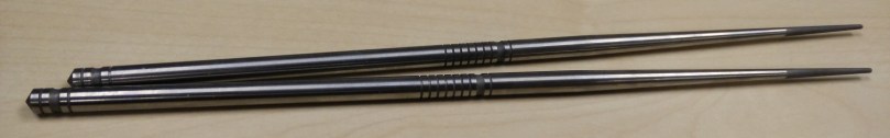
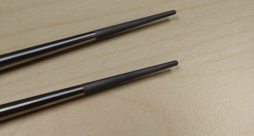
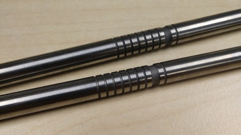
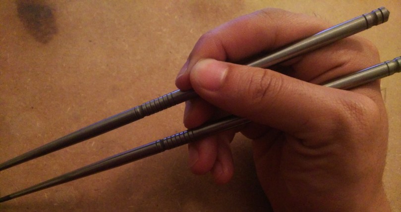
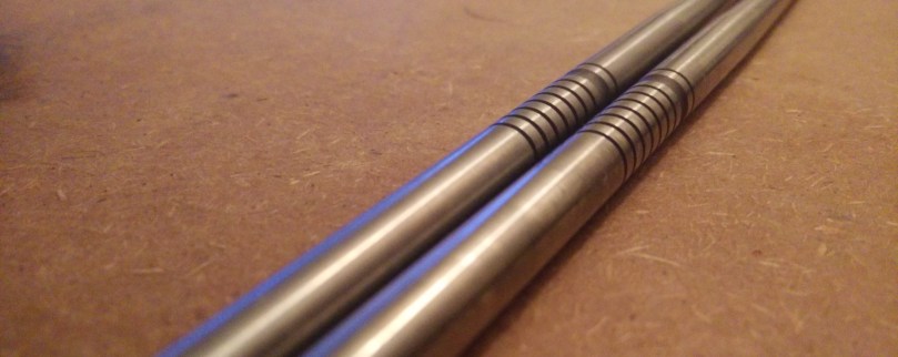
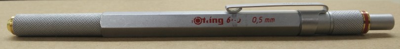
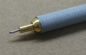
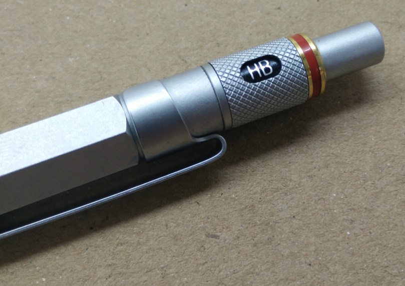
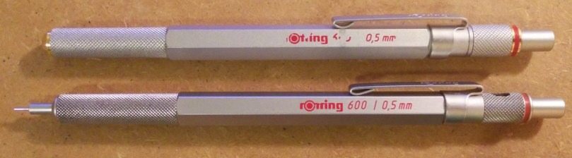
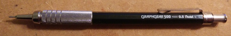
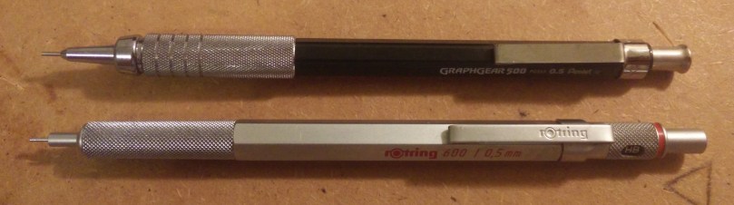
There are many similarities between the Pentel Graphgear 500 and the Rotring 600. Perhaps the most notable is the tip section. The Graphgear has a larger grip and has additional “milled” rings. Although it looks nicer than the Rotring, the Graphgear as a certain cheap feeling to it. I suspect I feel this way due to the metal that is used (steel in the Graphgear vs brass in the Rotring). The tips are of similar length although the there is more distance between the grip and tip in the Graphgear. This wastes more lead as there is more distance between the mechanism and the tip. Further, depending on how you like to hold pencils, the distance may be too long for your taste.IMG_20160511_230245

Another similarity is with the clip. Here, the designs are pretty similar and both have similar properties. If we’re grasping at straws, we can say that the Rotring’s clip allows for deeper carry, though it is mounted much lower than the Graphgear. On the other hand, the Graphgear’s clip is much more easily removed.

Conclusion

The Pentel Graphgear 500 is a great value. The metal grip and stamped metal clip are features normally seen on much more expensive pencils. However, due to the price, there were some shortcuts taken and, in the end, the more expensive pencils still outperform the Graphgear. However, I would definitely consider the Graphgear as a “throw in the backpack” or a secondary pencil.