Warther Wood Carving Knives

IntroductionIMG_20160321_194722

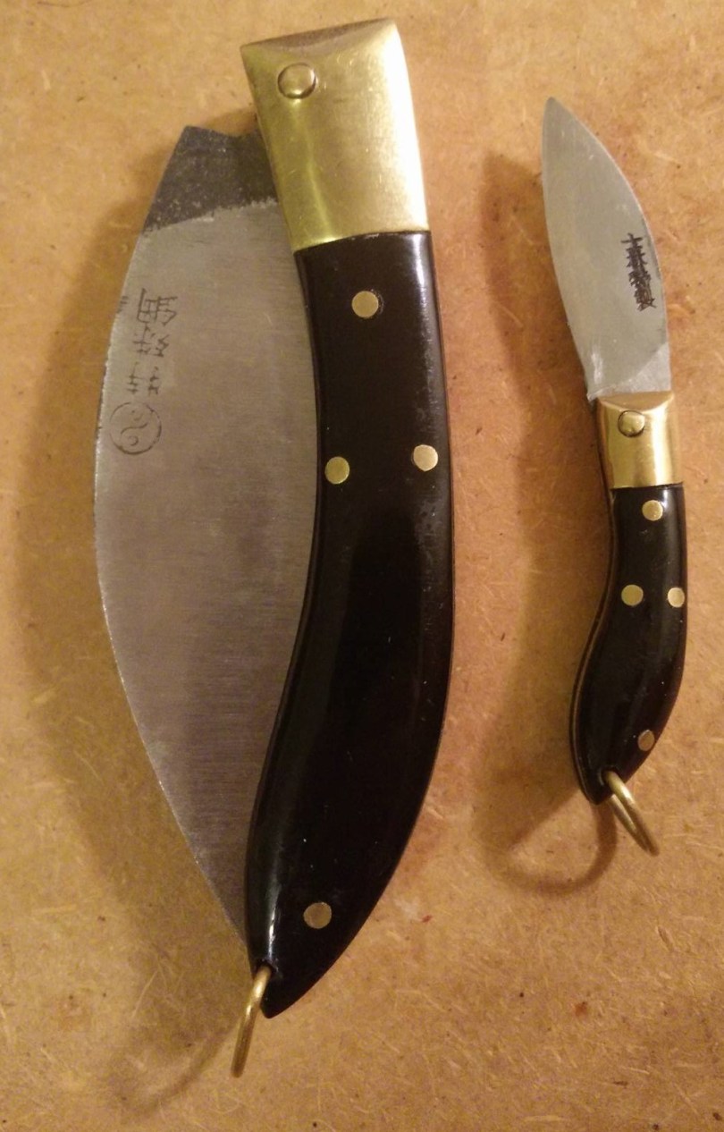
Ernest “Mooney” Warther was an American wood carver famous for creating train models and producing kitchen knives. He made his own carving knives, a unique design where different shaped blades were stored in the handle, as well as fighting (he called them “commando”) knives for members of the armed services. Here, I’ll be talking a bit about two of his carving knives that I have.

Specs

Place of Manufacture: USA
Blade Steel: 440c
Price: $37.50 (direct from Warther Cutlery)

Packaging

The knives come in these card stock boxes. The #1 model was purchased before the logo change as seen on the box.

Fit and Finish

It is evident that the knives are hand-finished. There are small issues with the knives such as handle curves that are uneven, blade grinds that are unsymmetrical among others. However, since the knives are hand-finished, they were able to remove sharp edges that might dig into the hand and ensure that the knife has no structural defects.

Functionality

This is where the knife shines. Although the steel is 440C, a relatively inexpensive steel, they have heat treated it to where it holds a decent edge. Furthermore, the blade shapes are well designed for what they are described to do:IMG_20160321_194753

#1 wood carving knife – Straight edge carving knife with 1.5″ blade. Used for scoring, lettering, and cutting straight lines.

IMG_20160321_194912

#10 wood carving knife – A small straight blade approx. 1″ long. This knife has a fine point for intricate detail work.

The #1 and #10 are similar in shape although the #10 has a finer point. I have the feeling that the #1 has a thicker blade nearer the tip than the #10 does as well. This is the biggest strength of these knives. Since they were designed by a master carver, they work great for what they are meant to do.

Pencil Sharpening

These knives, with their straight blades, work very well for pencil sharpening. I prefer to use the #1 as the #10 dulls too quickly. The handle allows for a comfortable grip and for the thumb to be placed on the spine of the blade. This makes accurate cuts easy.

Conclusion

While these knives may seem plain and simple to most, they are in fact well designed tools. The fit and finish could be improved, but for a handmade knife by a well-known American company at this price point, I have little complaint.

Eberhard Faber Mongol 482 No. 2 Review

Introduction

^DC5B2C5DCCC65AEB6A2B9E41054B63984E94A1D22AEDF59CC6^pimgpsh_fullsize_distr

The Mongol series from Eberhard Faber is a famous one. John Steinbeck was said to prefer Blackwings and Mongol 480s. Here, I have a box of 482s, which look as school-like as pencil can look. Do they stand up to their lore, or has age gotten the best of them? Let’s find out.

Specs

Place of Manufacture: USA
Price: $20-25 a box, up to $200 for early 1900s version

Packaging

^DC5B2C5DCCC65AEB6A2B9E41054B63984E94A1D22AEDF59CC6^pimgpsh_fullsize_distrIMG_20160326_162309

I love the box. It features a full size picture of the pencil on the front. There are many different fonts above and below it, drawing the eye to different sections. On the back, there is a brief description of the the pencil with the different hardnesses that it comes with. I believe this is the second generation of boxes. The first generation had an Asian theme to it.

It is two pieces, with one half larger than the other. The inner section pushes out to access the pencils.

The other sides of the box feature a similar design with the front with one of the edges having the hardness of the lead.

Fit and Finish

IMG_20160326_221302IMG_20160326_162443

Being a vintage pencil, it can be a bit difficult to judge quality. Over time, moisture and dryness can both affect the wood and the lacquer.

I immediately noticed a few issues with the printing. The printing was not very crisp and the lettering was not centered perfectly on the side.

IMG_20160326_221324

On the back, a bit of paint was chipped. It would appear as though this happened when the ferrule was attached. The ferrule itself has a gold band that has held up well over time. There is some discoloration on the black areas though.

Design

As stated before, the pencil has that school look to it. The yellow is similar to the cheap dollar store pencil shade and it has the pink eraser stuck to the end of it. That being said, there’s absolutely nothing wrong with a traditional look like this. In fact, I find it to be quite appealing, especially with the execution. The small details, such as the gold band around the ferrule and, once again, the fonts used really make this pencil stand out.

Functionality

IMG_20160326_220426

The pencil writes quite well. It has a tad of feedback like the Mitsubishi 9800 HB, but lacks some of the smoothness. It has a dry feeling on the paper rather. It doesn’t glide as much as move across the paper.

In comparison to modern Japanese pencils, such as the Hi-Uni and Mono 100, the pencil is harder. I like, however, how it produces a dark line while have little wear down. I can see myself using this pencil for a long time before sharpening. It compares well to a Cedar Pointe though I like the Mongol’s core a tad more.

Conclusion

I like the Mongol 482. It doesn’t write as nicely has a Blackwing 602 but it wasn’t meant to compete with it. The Mongol is a business and school pencil. It was designed for lots of writing and lots of use. Its original price point was low enough where you wouldn’t feel bad about losing it, comparing with the Blackwing which was a premium product.

I’m glad I picked up a box. I don’t think they’ll replace my Mitsubishi 9800s, but whenever I’m looking for a change, I’ll pluck one out of the box and give it a go.

Mitsubishi Vermillion and Prussian Blue Pencil Review

IntroductionIMG_20160319_163321

Red and blue combination pencils have been popular for a long time. They offer the user two contrasting colors in one writing utensil that can be used for tasks such as proofing, highlighting and drawing. Here, Tombow has produced a combination pencil with a unique ratio of red and blue. How well does this pencil work?

Specs

Place of Manufacture: Japan
Price: $7-8 for a box of 12


Fit and Finish

IMG_20160319_163302


Design


Functionality

IMG_20160319_163243


Conclusion


Mitsubishi Hi-Uni Review

Introduction

IMG_20160319_161307

The Mitsubishi Hi-Uni is a high end pencil. Two or three pencils equating the cost of a box of Mitsubishi 9800s, the Hi-Uni is supposed to be much better than its workhorse relative. But how much better can a pencil be?

Specs

Place of Manufacture: Japan
Price: $20-25 for a box of 12, $2-3 per pencil

Packaging

The Mitsubishi Hi-Uni comes in a nice plastic case when a dozen are purchased. There is an inner plastic divider to separate the two layers of six pencils. The build quality is quite decent and it keeps the pencils safe. I like it so much that I still use it to hold some of my favorite pencils.

Fit and Finish

IMG_20160319_161348

The level of detail and meticulousness that Mitsubishi has put into this pencil is amazing. The maroon lacquer is perfect (out of the box, that is) and there are no scratches nor is there chipped paint. The lettering is crisp and precise all around. The foil band around the end is straight and fits perfectly in the groove that is cut into the wood. The graphite core sits very centered. I have no complaints at all.

Design

IMG_20160319_161307IMG_20160319_161339

The design of the Mitsubishi Hi-Uni has one flaw: the clutter. The barcode on the backside along with the UPC set this back from other pencils such as the Blackwing.

Similarly, the multitude of fonts used on the pencil can make it an eyesore.

However, the colors used, red, black and gold, work well together.

Functionality

IMG_20160319_161754

The jump from a 9800 to the Hi-Uni is quite evident. The Hi-Uni has a much smoother core than the 9800 while maintaining a certain level of feedback. The pencil is obviously harder than a Blackwing 602, but will not lose to it in terms of smoothness. It has a bit of residue when writing with lots of pressure, but normal writing will erase well.

Sharpening the pencil is fun. The cedar the Mitsubishi has used in the pencil smells great and sharpeners glide through the wood.

Conclusion

The Mitsubishi Hi-Uni is a high end pencil. It features a good lead core, nice wood and great fit and finishing at a more expensive price. It has a few design issues, but overall, it is a great pencil.

Ohto Sharp Pencil (APS-350ES) Review

Introduction

IMG_20160313_173858

I love mechanical pencils. I love wooden pencils. The Ohto Sharp Pencil line tries to get the post of both worlds. It looks like a wooden pencil. It feels like a wooden pencil. But, 0.5mm lead comes out and the ferrule is actually a push button. How well does it actually work?

Specs

Place of Manufacture: Japan
Price: $5 (from Japan), $15 (Amazon)

Packaging

IMG_20160312_221558IMG_20160312_221835

The pencil came in a simple plastic packaging. It opens via a flap on the bottom.

Fit and Finish


IMG_20160313_173909

The finish on the pencil is superb. The lacquer is smooth and the silver foiling is sharp. The clip fits well and does not wiggle. The eraser cap is of a little concern though. While it is firmly attached, there is wiggle associated with it. I believe this is from the entire mechanism inside not being that sturdy.

Design

I believe that this is essentially a wooden pencil without the graphite with a mechanical pencil mechanism stuck in. The mechanism is not attached on the top except for the eraser cap. The end piece where the clip is attached to seems to only provide place for the clip and offers no other purpose.

IMG_20160313_173941

Functionality


I like the form-factor of this pencil, but at the same time, it is its biggest weakness. The pencil feels out of place in the hand, not because it is too short, but because of its diameter. It almost feels like trying to grip a toothpick. I did use it for an entire day of note-taking and found it to be tolerable nearing the end of the day. However, I would definitely recommend a thicker pencil if you want comfort.

However, due to the length and diameter, this pencil is quite useful in many ways. It can easily be slipped into a pencil case or sleeve as a backup pencil as it does not take up that much room. It can also be placed in a shirt pocket without fear of it making a hole as it is not long enough.

Conclusion

As always, this pencil has a specific purpose and it does it well: it is for convenience, not comfort. It is meant for backup use or a gimmick and not a workhorse. In that regard, it works very well. Don’t force it into tasks it shouldn’t handle and you got yourself a nice mini-pencil.

Lamy Al-Star Review

Introduction

IMG_20160311_153710

As with many fountain pen enthusiasts, my first fountain pen was a Lamy. I received the Lamy Al-Star as a gift after expressing interest in writing with fountain pens. It doesn’t get used as often as my Platinum 3776 Century. Read on to find out why.

Specs

Dimensions: 140mm (length), 13mm (diameter)
Weight: 20g
Place of Manufacture: Germany
Price: $47 (retail), $37 (most retailers)

Some History

The Lamy Safari is one of the most common starting pens. Being inexpensive, coming a reputable (debatable) manufacturer, and being fairly durable, it lightens the learning curve. The Al-Star and the Vista are variants of this design, with the nib and feed remaining the same. The Vista is transparent while the Al-Star is made of anodized aluminum.

Fit and Finish

The Al-Star has somewhat better tolerances than the Safari. It suffers some of the regular issues such as a hit-or-miss feed and nib as well as some general quality issues with the body. For example, the plastic has a few ridges from the molding and the LAMY engraving (or perhaps pressing) on the body has irregularities in the corners.

IMG_20160311_153645

Functionality

The pen comes in all normal Lamy Safari nib sizings. This fine nib is a European fine and puts down a line equivalent to a Japanese medium.

IMG_20160311_164407

The pen does not have much flex.

The converter is a Z24 that can hold around 0.6 mL.

Conclusion

As a first fountain pen, the Lamy Al-Star has some merit. It has a solid construction and the pricing makes it almost acceptable to drop it nib-first on the ground when you’re still learning your way.

With European nib sizing, it can be a bit hard to get finer lines and the irregularities and inconsistencies with Lamy production can make one pen lovely to use and another pen a prop.

For beginner pens, I’d personally recommend the Sailor HighAce Neo. While quality of construction is about the same, the quality of the nib is a bit better and it comes in at a lower price.

Midori MD Notebook Review

This is my first paper review so bear with me please.

^577644A761D9D98E576A49EAA90F5EBD5CC9777644E708C096^pimgpsh_fullsize_distr

Midori probably most famous for their Traveler’s Notebook series. They’re essentially a combination of a leather slipcover for replaceable notebook inserts. However, they produce a multitude of other great products, such as my Brass Pen Case. When I was looking for a journal, I considered Rhodia and Leuchtturm1917 among others, but I eventually settled on Midori, partially to test out their paper quality.

Specs

Dimensions: 8.3 in (length), 0.4 in (depth), 5.8 in (width)
Paper Size: A5
Pages: 88
Weight: 260g (9 oz)
Place of Manufacture: Japan
Price: $15.50 (retail)

Background

The Midori MD is a bit different when compared to other journals in that it does not have a sturdy cover. Instead, Midori offers plastic, recycled paper, and leather options. The plastic is the cheapest coming in around ~$5 while the leather one is around ~$70. I have been using mine without a cover and the cardstock cover has been holding up quite well.

Packaging

The journal comes in a plastic sleeve that has an adhesive flap. This makes taking the notebook out quite easy. Then, there is an additional layer of tissue paper on top of which is a blue half-sheet containing the name as well as some information on the journal.

Design

IMG_20160309_205726

The journal comes with a small sheet of stickers that can be affixed to personalize the journal.

IMG_20160309_205815

The cover is almost blank with a small Midori logo embossed on the left hand side.

img_20160309_205823 copy

The first page of the journal features a title page with two lines. It is quite simple and the font is matching (*cough cough* Life notebooks) making for an attractive design.


IMG_20160309_205836

The grid design is one that I have not seen before. The lines are not connect and, instead, they look more like a square “U” i.e. |_|.


The back features a bit of information (which I unfortunately cannot read).

IMG_20160309_205847

Functionality

As I am a frequent fountain pen user, having fountain pen ready paper was a necessity. The label showed no signs of feathering when I wrote the start date.

wp-1457666540230.jpg

On the actual paper, the paper fared well with both pencil and pen. I have yet to find any complaints about the paper quality.

img_20160310_123029


img_20160311_170538

Conclusion

At this point, I love this journal. It features a simple design, the paper feels premium, and the price was acceptable. I will continue to update this review as I use it to provide a more comprehensive overview!

Small Higonokami

Part II of my Asian knives this week. Again, I don’t really consider this a review as much as just some talking notes about the knife.

The higonokami is a traditional Japanese folding knife. It is s friction folder with a one piece handle made of brass. The blade is some sort of high carbon steel and a hamon (temper) line is visible when held at an angle.

IMG_20160307_152128

There is a large domed pivot that looks like a rivet. It can be a tad stiff to open the knife.

IMG_20160307_152324

Speaking of opening, the knife is opened by using the thumb latch (?) connected to the blade. There is a hole on this lever. In some online reviews, this particular models supposedly sometimes comes with a bell. Mine did not.

There is a tad of writing on the handle. I do not have a translation for it.

For a good overview of the Higonokami, some history on them and information on current production, check out this British Blades forum post.

Shilin Cutter (士林刀)

I’ve always been a sucker for vintage and old styles, so the Shilin Cutter, with its large blade, thin handle and brass construction, appeals to me in many ways. The knife has an interesting history, with its manufacturing starting off in mainland China before moving to Taiwan during the Chinese civil war. It’s modern history is a bit messier, with family squabbles taking down the main manufacturer and a wave of custom makers spawning. For a fairly comprehensive history and overview of the Shilin Cutter, check out this British Blades forum post.

I acquired two examples of the Shilin Cutter this past summer at a small knife shop in the middle of a traditional market in Taiwan.

The first knife that I saw was this small one. The blade length is about the diameter of a quarter. It was kept under a glass panel in an old plastic bag. I immediately said “Yes, I’ll take it” before asking if she had anymore.

She pulled out this larger knife (size comparison at the end). She would not let me remove the knife from the bag it was kept in nor would she open it in front of me. I looked it over and it seemed like any other NOS (new old stock) knife, with a bit of patina and discoloration. Boy, was I wrong…

This larger knife had a multitude of issues, including a backspring that was so not flush that it makes the knife unusable. The sharp brass edges catch in the nooks of my hand making any task impossible. Furthermore, there was a rolled edge and the stamped logo was very faint.

With both knives, there was a thick layer of a mysterious “gunk”. I would assume that it is a type of oil something to keep the blades from rusting. I was told the smaller knife was made out of “white steel” which, if it is like anything the Japanese use, is a high carbon steel. While I was able to get most of this substance off the smaller knife, it was much more difficult on the larger blade and I eventually gave up.

I am disappointed with this experience? Both yes and no. I got one knife that I have no idea what to do with. I might experiment with grinding down either the blade or the backspring to make the larger knife useful, but that will be a project for some time down the road. On the other hand, I absolutely adore the smaller knife. Sure, the backspring has some gaps with the scales, but I honestly don’t mind that much. The knife wasn’t meant to hard tasks and as long as it stays on my desk or on my keychain for use as a letter opener, I don’t see myself noticing its flaws.

Next time I’m in Taiwan, I’ll check out some of those custom makers. The prices can get a bit high, so there’s no guarantee that I’ll purchase anything.

As a piece of history, these knives are certainly interesting. As tools, their design has the opportunity to be much more than the examples that I have. With tighter tolerances and more attention to detail, I could see myself “EDCing” one of these.

For more information, check out the original Shilin knife site or the aforementioned British Blades forum post.

Platinum Century 3776 EF Review

Introduction

Processed with VSCO with a6 preset

My Platinum Century 3776 is my daily driver for all my writing tasks. Whether I bring it to class, I clip it to my shirt when I’m all dressed up, it’s usually either in my bag or in my pocket. Sure the body has signs of wear due to all this carrying, but I wouldn’t have it any other way. Here’s some words on my trusty fountain pen.

Specs

Dimensions: 120mm (length), 13mm (diameter)
Weight: 20g
Place of Manufacture: Japan
Price: $220 (retail), $70-100 (eBay, direct from Japan)

Background

When I was picking out my next fountain pen,I had a Pilot Custom 74 in one hand and the Platinum in the other. These two pens are are very similar in many ways. They are of similar length, made of similar material, and both feature 14k nibs. However, there were a few small differences that made me choose the Platinum over the pilot.

PackagingIMG_20160304_221648

The pen comes in a plastic snap box, housed in a white cardboard sleeve. The case feels appropriate for a pen of this price. It is sturdy and cushioned for the pen. The ribbon holding the pen is taut and it can be a bit difficult to put the pen back if you wanted (as I did for the pictures).

Fit and Finish

IMG_20160304_221818

The pen body is made out of resin which I assume is an alternative (fancier/more accurate) name of the type of plastic that is used. The light weight can be a tad off-putting and the texture that it has can feel a bit cheap.

The pen has gold trim from top to bottom. The cap features a gold pocket clip and there is a gold band with the name of the pen around the bottom of the cap. Additionally, there are two more smaller gold bands on the main body of the pen.

The nib is rather large in comparison with the Pilot (this was one of the reasons I chose the Platinum). The gold content, Platinum “P” and “#3776” are engraved on the nib.

The pen supposedly comes with a “Slip and Seal” technology mechanism that is to keep the ink from drying out for up to 24 months. The spring and additionally plastic sleeve used in this technology is easily seen through the plastic cap.

Functionality

IMG_20160308_164037

I’m a student and this pen is exactly what I need it to be. I don’t need super flex or BB nibs. What I need is a pen that will work day in and day out. This is exactly that pen. The thin narrow line that it produces is not overly wet, though it starts every time.

The body is very prone to scratching. I don’t carry the pen in the same pocket as my keys, but scratches of all sizes have slowly appeared. The trim, however, does not seem to have chipped at all.

Conclusion

I have no regrets with this pen. Sure, it has an outdated appearance and can look a bit out of place. However, the way it performs and the feeling it has in my hand is… I can’t put it in words.